In today’s digital-first world, your website is more than just a digital storefront—it’s the face of your brand, the core of your communication, and often the first touchpoint for potential customers. Whether someone is browsing on a smartphone during a commute, using a tablet at home, or viewing on a desktop at work, your site needs to deliver a consistent, engaging, and intuitive experience.
That’s where responsive design comes in.
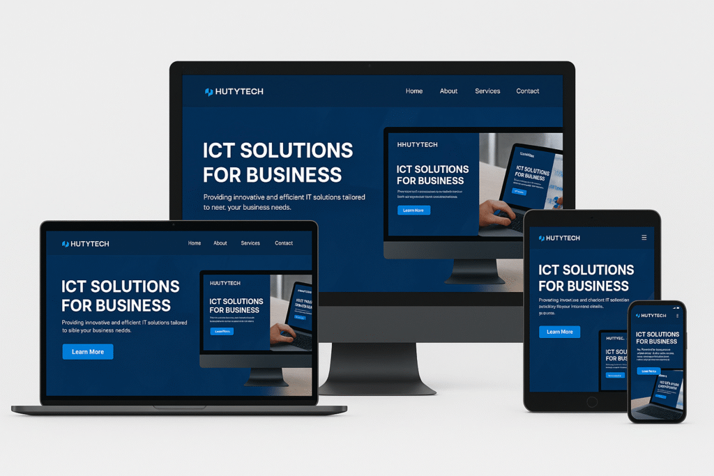
📱 What is Website Responsiveness?
Responsive web design means creating websites that automatically adapt to the user’s screen size and device orientation. Instead of building separate sites for desktops and mobiles, responsive design ensures a seamless experience across all devices—including smartphones, tablets, laptops, and desktops—using flexible grids, images, and CSS media queries.
🚀 The Key Benefits of a Responsive Website
Let’s explore why responsiveness is no longer optional—it’s essential:
1. Smooth Layout Across All Screen Sizes
A responsive site intelligently adjusts the structure and content to fit any screen size. This prevents users from having to pinch, zoom, or scroll endlessly, making navigation feel natural and intuitive.
2. Easy Navigation and Readability
Menus, buttons, and text adapt to different devices, ensuring readability and usability. This reduces bounce rates and encourages users to explore more of your site.
3. Faster Load Times
Responsive design often includes optimization techniques like image scaling and minimalistic layouts. This leads to faster load times—especially on mobile networks—which directly impacts user satisfaction and SEO rankings.
4. Better User Engagement
When users can interact with your site effortlessly, they’re more likely to stay longer, engage with your content, and take action—whether it’s making a purchase, filling out a form, or sharing your site with others.
5. Higher Conversion Rates
A well-optimized experience on any device reduces friction in the user journey. This leads to better conversions, whether it’s sales, sign-ups, or other business goals.
🧠 The Often-Overlooked Truth: UX Can Make or Break Your Project
Even if you’ve invested significant effort on the server side—building out robust features, secure backend systems, and powerful logic—none of that matters if users can’t access or enjoy the experience.
A poor User Experience (UX) can instantly turn users away, leaving them with the impression that your entire project is subpar.
It’s not about what your system can do, but how effortlessly users can interact with it. If they struggle to navigate, understand, or simply view your website on their device, they’ll likely exit—and may never return.
🎯 Don’t Let Great Work Go Unnoticed
Think of your website as your digital handshake. A responsive and user-centered design makes that handshake firm, confident, and welcoming.
So here’s the takeaway:
Make every click count.
Design with your users in mind.
Perform excellently, everywhere.
🔧 Not Sure If Your Site is Responsive?
You can:
- Test your site on tools like Google’s Mobile-Friendly Test
- View your site on multiple devices and screen resolutions
- Work with professionals like Hutytech ICT Resources to audit and improve your site’s responsiveness and user experience.
📌 Final Thoughts
Responsive design is no longer a trend—it’s a standard. If you want to build trust, credibility, and engagement in the digital space, your website needs to look and perform great on every device.
Start today.
Design smart.
Deliver excellence.
#WebDesign #ResponsiveDesign #UXMatters #MobileFirst #DigitalExperience #Hutytech